
Because more and more people are using their mobiles to access the internet, sometimes it gets quite tricky. To get to know the difference between responsive, adaptive and mobile-friendly websites, keep reading.
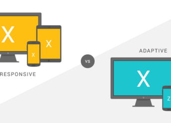
Responsive Websites
On the websites with a responsive design, the mobile user is the top one priority.
The responsive websites sizes change simultaneously with the browser’s ones depending on the device used. It also, depending on the width of the browser, adjusts the design elements.
The user also makes is change when they choose the browser size. When you make your browser smaller while on a desktop computer, the website will adjust to it. This change will happen most optimally.
When it comes to mobile devices, the responsive websites take into account its size in the background before arranging the content to fit the best.
Even though this type of website is not made for mobiles, it still works quite well.
Adaptive Websites
The adaptive website can be considered the cousin of the responsive website because it mainly changes the browser size of the user and the elements of the site all considering the device. It will only adapt specific element to different screen sizes and browse contrary to dynamizing all the content.
There is a wide range of fixed layouts that designers create. The website chooses which one suits best your device.
The adaptations are pre-determined, so there is no dynamic process which can adapt itself.
Mobile-Only Websites
This type of website has an “m” in the URL, and it is a fading option. It makes the site best for mobile use.
This is also known as a standalone mobile site which is different from the desktop version. It includes the same elements as the desktop one.


I’m Francis E. Hagopian, and I’m the voice and vision behind Billionaire365.com. For the last 15 years, I’ve lived and breathed Silicon Valley culture, arming myself with insights and know-how that I can’t wait to share with you. Think of me as your personal guide in the intricate maze of technology. I specialize in translating the complex into the understandable, so you can turn knowledge into power. This isn’t just about staying in the loop; it’s about giving you the tools you need to excel in a digital age. When you’re looking for reliable tech insights, know that I’ve got your back.