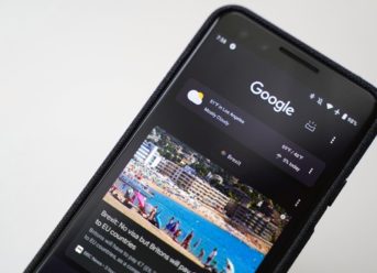
The dark mode has become very popular in recent years, and it is now available on most flagship devices. From saving battery when you are using your device during the night (while also keeping your eyes safe) to a mere personalization choice, dark mode is a feature which has managed to build a strong fan base.
The mode is available on Pixel 3 devices, and some users have reported that it may have found its way to new features. Some users have captured screenshots and pictures of an unusual Android update screen, which appear to use a slightly different dark mode. The images were posted on a popular forum platform, sparking the curiosity of thousands of users who rushed to share their opinion on the subject.
Usually, Google prefers to employ a variety of greys with its dark mode. The images reveal a pure black menu, with only the text and the buttons being white. That has attracted widespread criticism as some users claim that the screen may have been faked with the help of a custom theme or by opting to activate the color inversion feature which can be found in the settings menu (and which produces a similar result, according to users which tried to replicate the results).
Some Google Pixel 3 users are puzzled by a mysterious Android dark mode update menu
The person who started the thread shared another screenshot in which the multitask menu appears, proving that he or she didn’t activate the color inversion feature.
Others have also noted that they were greeted by the same screen and they use the latest Google Plays Services version (16.0.81). It is also argued that the theme may be linked to the Device theme setting which is available on Google Pixel devices.
Another round of debates was sparked after some users who run the same Play Services version said that they didn’t encounter the Android dark mode update screen. They argue that it may occur if people are running a beta version of the Play Services. Google has recently released an update which changed how the update menu looks like, making it more similar to the Material Design theme.
I’m Francis E. Hagopian, and I’m the voice and vision behind Billionaire365.com. For the last 15 years, I’ve lived and breathed Silicon Valley culture, arming myself with insights and know-how that I can’t wait to share with you. Think of me as your personal guide in the intricate maze of technology. I specialize in translating the complex into the understandable, so you can turn knowledge into power. This isn’t just about staying in the loop; it’s about giving you the tools you need to excel in a digital age. When you’re looking for reliable tech insights, know that I’ve got your back.
